The Penticton Vees will defend their B.C. Hockey League championship with a brand-new look next season.
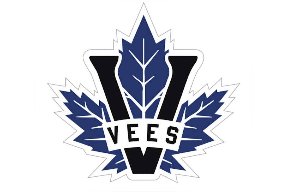
The most recent Fred Page Cup winners revealed an updated colour scheme Friday, Aug. 26, as well as a new logo that features a redesigned blue and white maple leaf.
“We are excited about moving forward with a new look,” said Fred Harbinson, the Vees’ head coach, general manager, and president. “Change from what you are used to is never easy, but we feel this logo will create a fresh and exciting look for our players and fans.”
The team says the new logo “reflects the rich hockey history in Penticton,” with the “V” once again predominantly showcased.
Penticton’s new primary logo features the maple leaf in both blue and white versions.
The team’s colour scheme, meanwhile, also got a refresher on Friday, with the team introducing a deeper, more vivid shade of blue. A secondary “Vees” wordmark will also be featured during the 2022-2023 season.
“I wanted to create a logo that was a blend of 1950s era hockey and the most recent Vees’ logo,” said graphic designer Luke Fraser. “My main goal was to go back in time and give the Vees a timeless and classic look.”
Friday’s announcement marks the first time in 18 years the team has changed its logo.
Penticton had a branding overhaul in 2004 when the team changed its name from the Panthers to the Vees.
READ MORE: Penticton Vees coach ‘suspended’ and stuck on a treadmill until 30 season tickets sold